
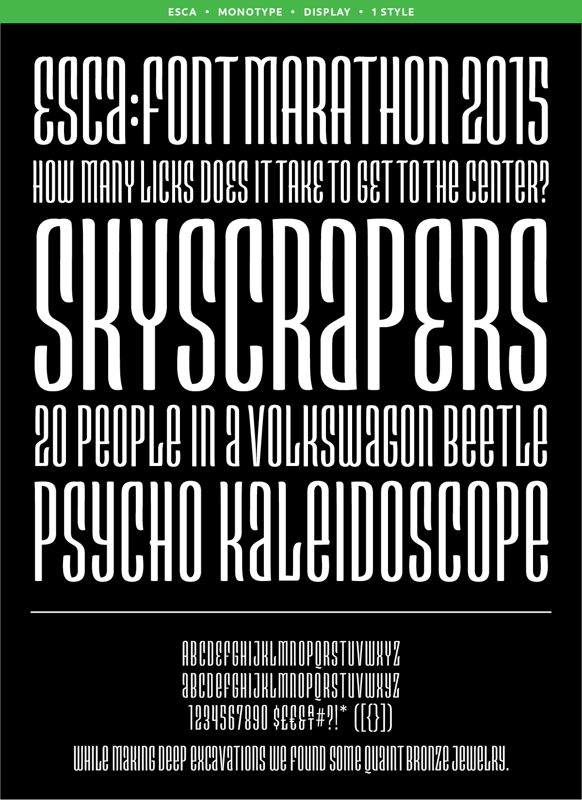
The typeface was originally designed as part of a Font Marathon over the course of 3.5 days in Monotype’s NY office. The design started with the aim of fitting 4 letters onto one sheet of paper and the resulting typeface keeps that tight proportion.
The Esca design is mixed case and is ideally suited for logos, short headlines, and album covers. It has a great architectural feel to it that makes it suitable in signage applications and large scale settings.